Ruter – Illustration Universe
Type of project: Client project
Client: Ruter AS
My role: Illustrator, Designer
Responsibilities: Concept, Illustration, Design, Print, Digital
Tools: Adobe Illustrator, Adobe Photoshop
Creative Team: Thale Høy-Petersen, Ingrid Lea
Client: Ruter AS
My role: Illustrator, Designer
Responsibilities: Concept, Illustration, Design, Print, Digital
Tools: Adobe Illustrator, Adobe Photoshop
Creative Team: Thale Høy-Petersen, Ingrid Lea
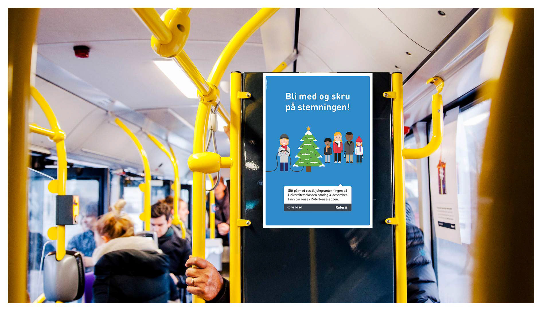
For the ever on-going Always On campaigns for Norwegian public transport company Ruter we created a new creative concept, which is based on illustrated, playful characters. We wanted to communicate to the people of Oslo that Ruter always has a transportation option for you, so that you'll be able to experience all the many things happening around this beautiful city.
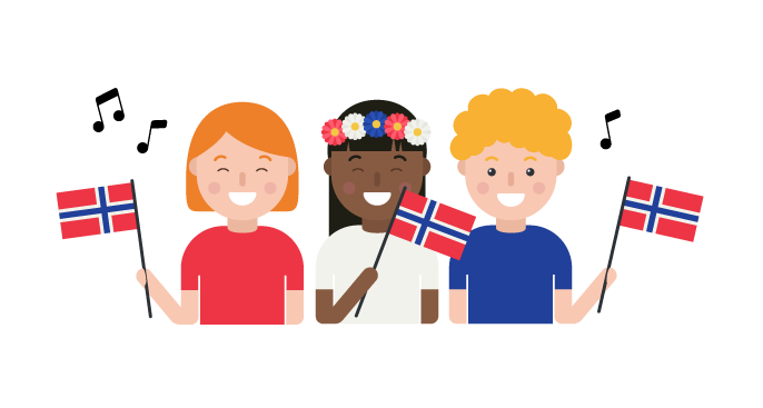
The characters
In order to create a consistent character library I decided to build the bas for the characters using basic geometric shapes. In this case, using geometric shapes helped me to create a coherent visual style which is easy to expand and buil upon when needed. It also helped me to achieve a unified look and feel throughout the entire character library and the campaign. Keywords during the process were friendly, relatable, cute, inviting and fun.
In order to create a consistent character library I decided to build the bas for the characters using basic geometric shapes. In this case, using geometric shapes helped me to create a coherent visual style which is easy to expand and buil upon when needed. It also helped me to achieve a unified look and feel throughout the entire character library and the campaign. Keywords during the process were friendly, relatable, cute, inviting and fun.
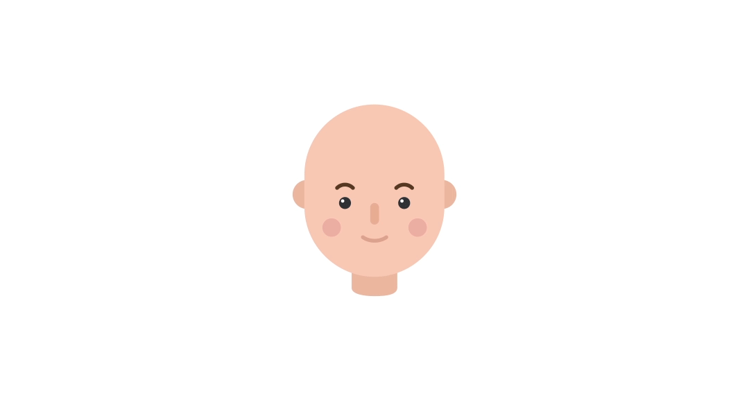
Facial expressions
This is the library of facial expressions in which every character takes it start. After creating these basic expressions it w as easy for me to create new one throughout the project with starting point in one of the faces below.
This is the library of facial expressions in which every character takes it start. After creating these basic expressions it w as easy for me to create new one throughout the project with starting point in one of the faces below.

Diversity
Diversity and inclusiveness was two important words in this project. It was important to let people being able to relate to the characters.
Diversity and inclusiveness was two important words in this project. It was important to let people being able to relate to the characters.

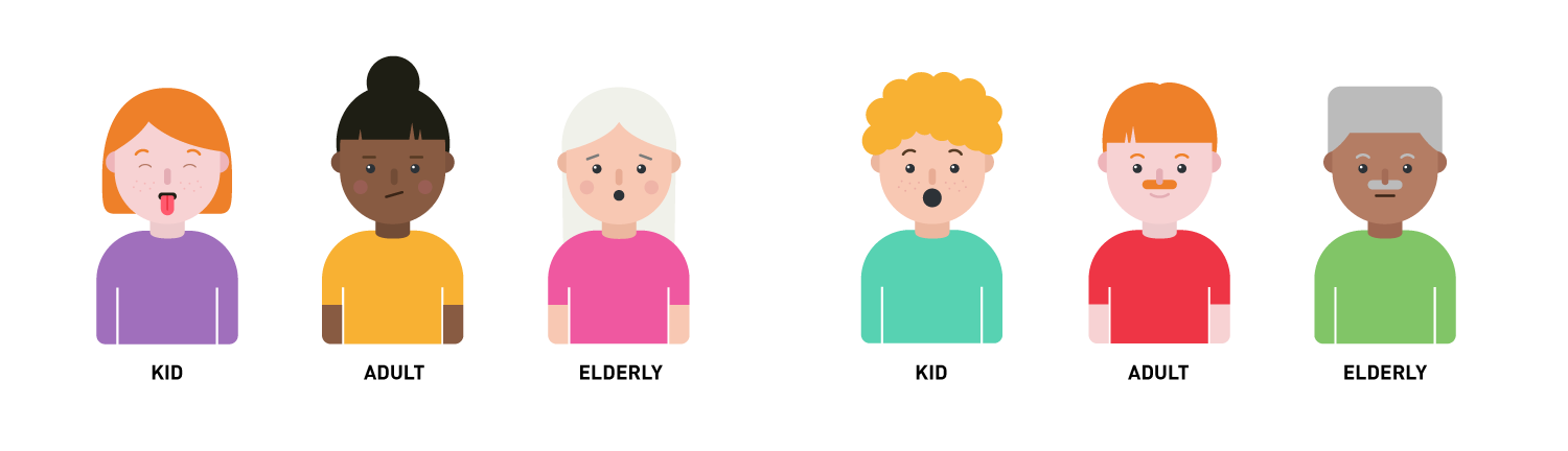
Age and gender
In regards to the illustrations being relatable and inclusive we also decided to create character within the categories of women, men, kids, adults and elderly.
In regards to the illustrations being relatable and inclusive we also decided to create character within the categories of women, men, kids, adults and elderly.
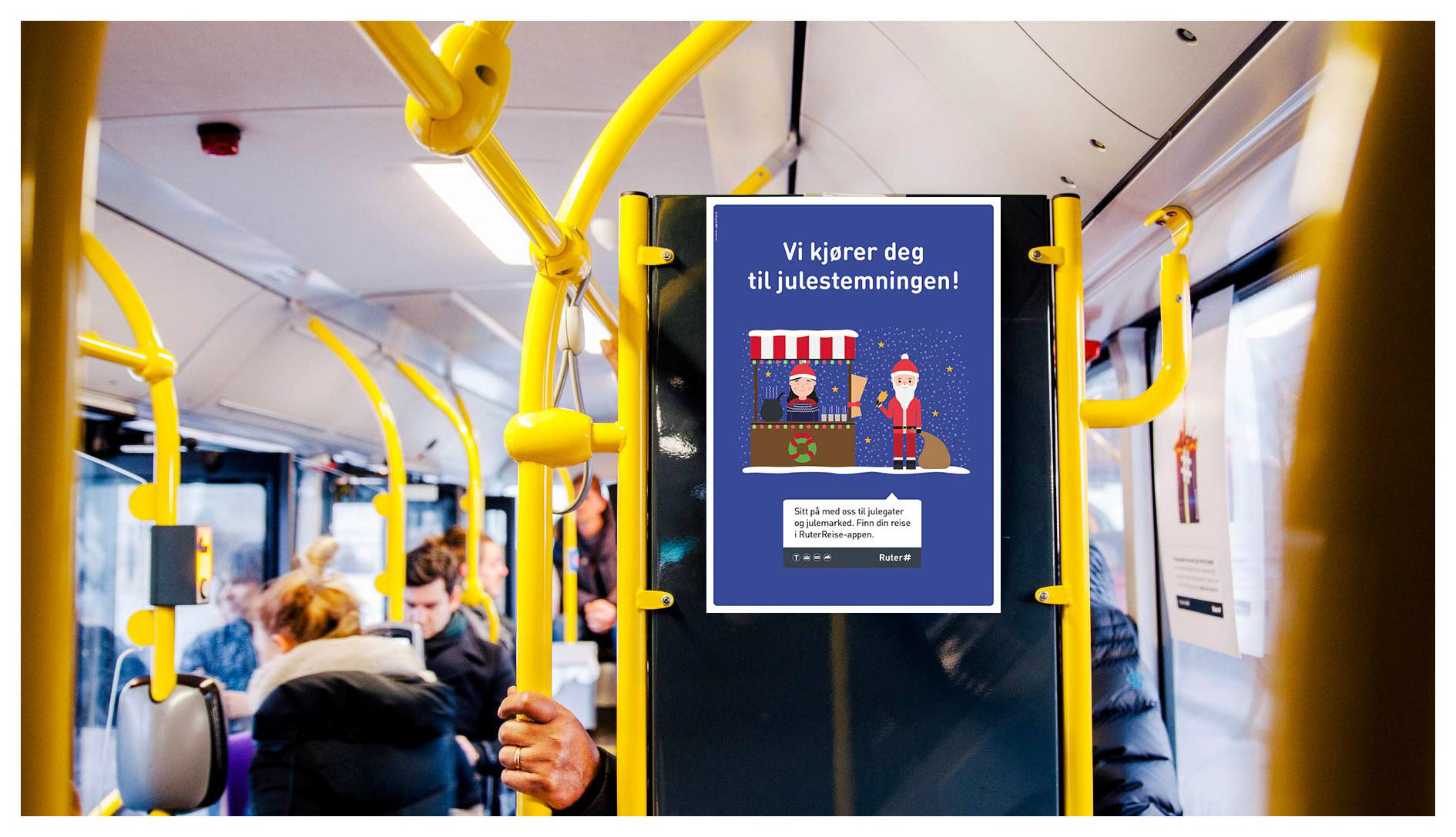
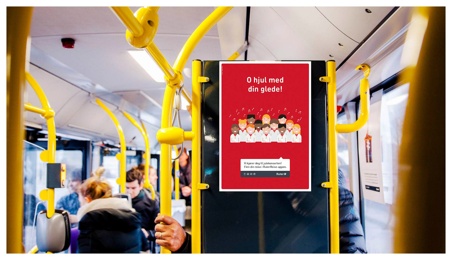
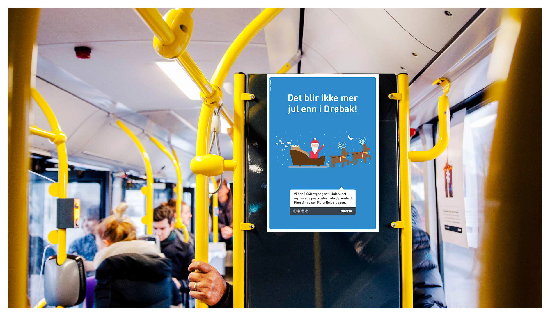
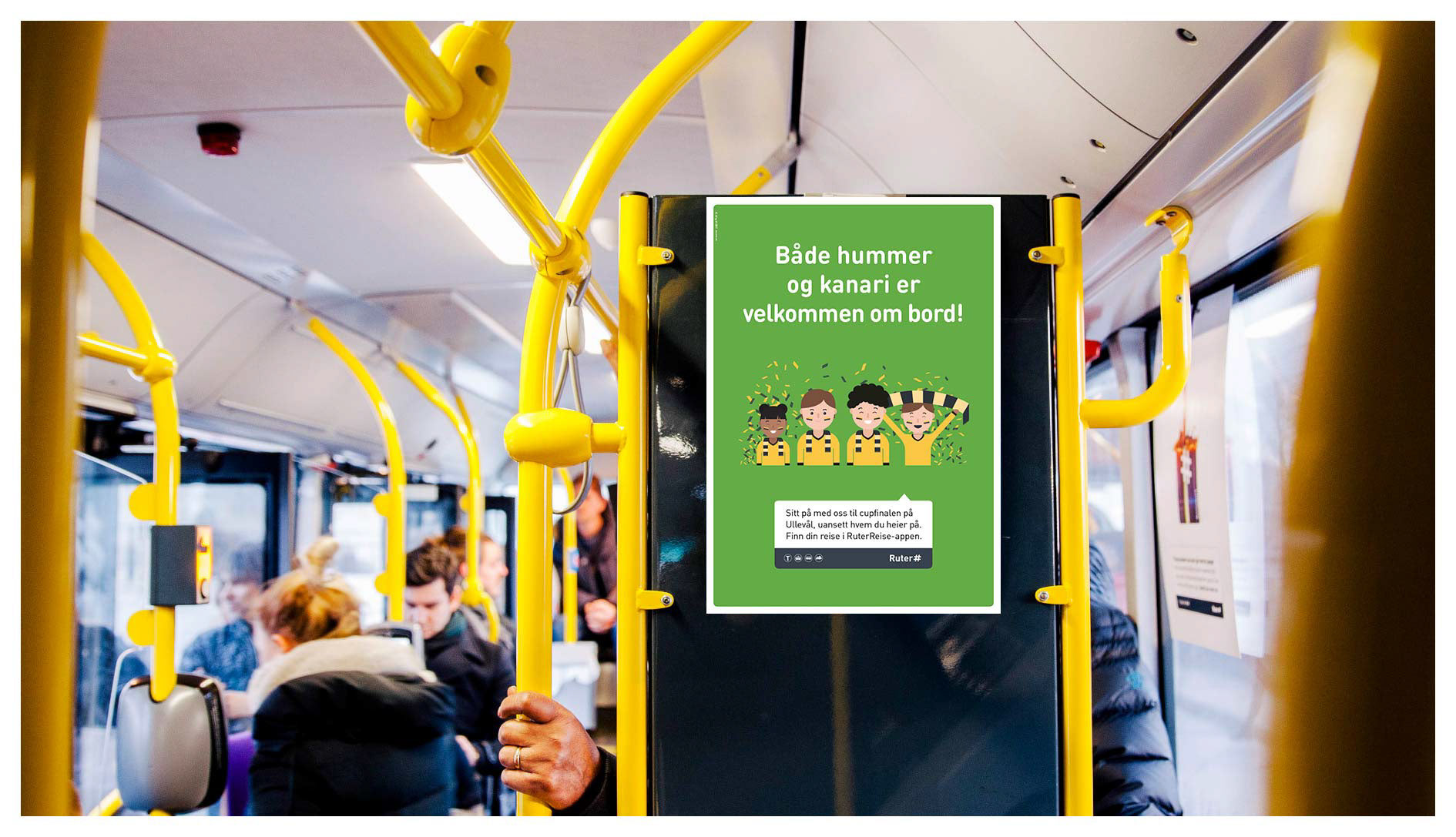
A selection of finished illustr
ations used in the campaign:
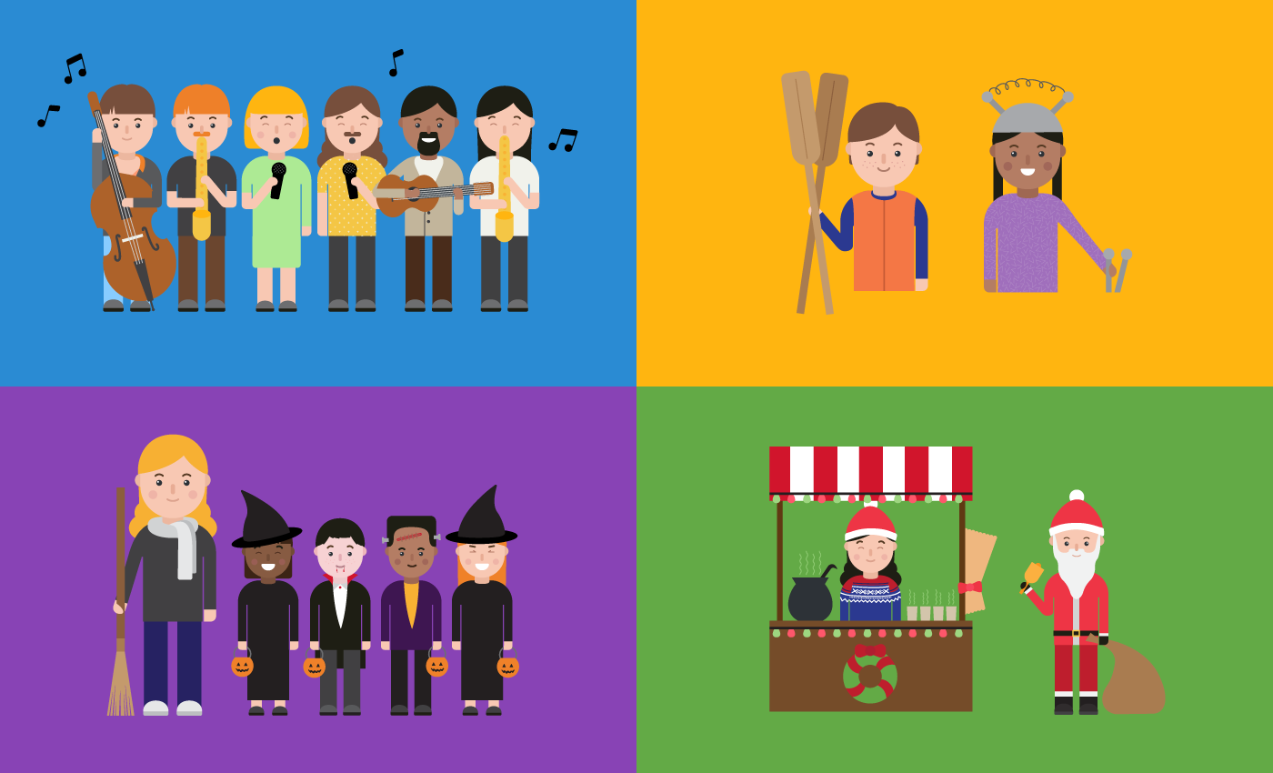
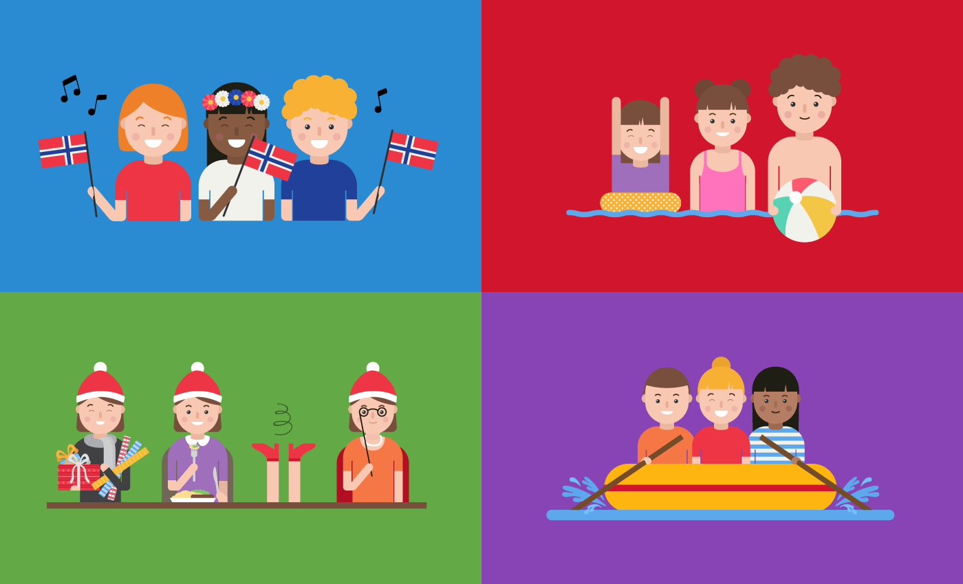
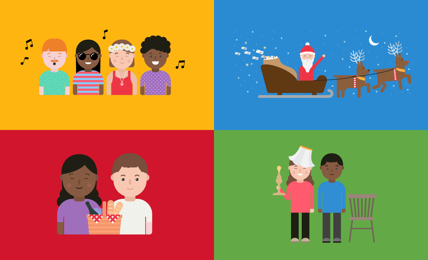


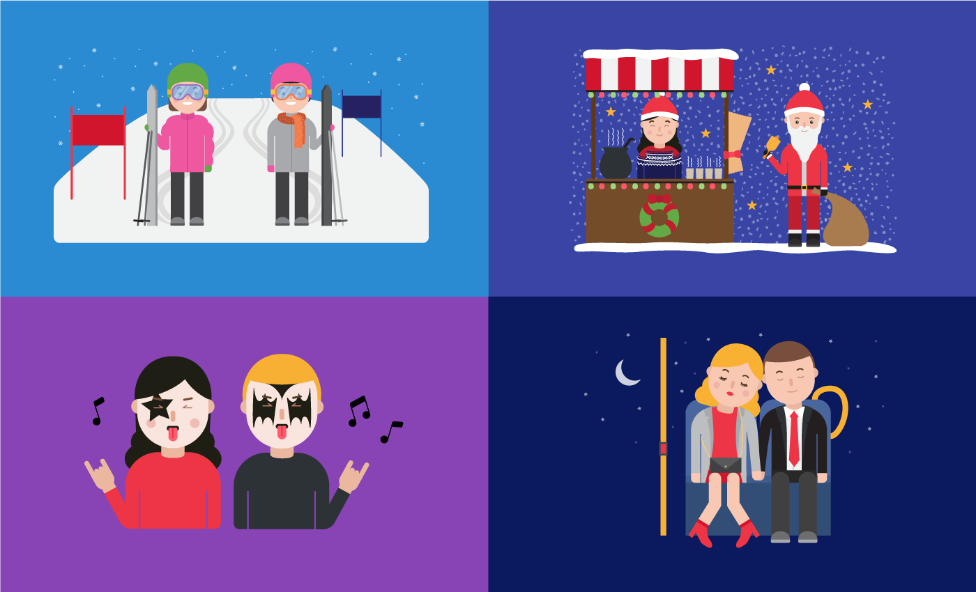


Some examples from the campaigns (also used for big
outdoor adshels, ad banners in the subway stations, digital banners etc):
outdoor adshels, ad banners in the subway stations, digital banners etc):